ShopDreamUp AI ArtDreamUp

Deviation Actions


Description
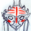
Deline from AmaranthineRain's With Torrential Force. You should check it out if you haven't already ") It's an interactive mythology-based fantasy story!
It's an interactive mythology-based fantasy story!
Image size
668x800px 870.31 KB
© 2018 - 2024 MaggiefromSpace
Comments9
Join the community to add your comment. Already a deviant? Log In
Hiya friend! I'm coming in from ProjectComment to hopefully give some helpful comments!
First, I want to start with the positives of this piece. The anatomy and actual construction of the piece are very well done. I think that people often get a little confused when they use angles that are a bit different, but you did a good jobe of keeping the face well aligned and logical with the position you chose. This is especially admirable considering this is a traditional piece, so you had not "horizontal flipping" to help you see if anything was off-- great job there! I also like the detail and how well you followed through with that detail. What I mean by this is that you chose to include things like zippers, piercings, etc, and allowed them to make sense rather that just drawing them. The fact that you indicate that the rings are 3D objects by actually showing their structure is very good and an important practice that all artists need to keep up. Same goes for the zippers; you actually acknowledge their structure by showing a believable alternation of the pieces on the entire track. They seem like little things, but it's something I always am happy to see artists do.
There are two things to work with towards the future. First, the line work is a little inconsistent. In some areas, you have lines that are precise (like in the face) while some areas have lines that are a little more sketchy (the hair). It would be good to do one or the other rather than harboring both in one image. Second, the coloring is a bit inconsistent, particularly in texture. I'll give the same advice I give to anyone who uses crayons, pastels, etc. that are very texturized-- use a flat, smooth base under your paper to control the texture a bit better. That way, the shading and variety of color you use in your piece will shine more! It seems you found a way to make the color a little more consistent in parts of the image, particularly the hair. In the future, it would be a good idea to either do the same with the face, or to not smooth the hair so that it matches with the skin.
Overall, this is a nice drawing! There are some things that you could do to improve it, but I think that overall you constructed something that is pleasant to look at and is inviting for more story behind the character. Great work!!